Decoding Per-Pupil Spending: The Most Misunderstood Metric in EdTech Sales
Why a $15,000 district might have less budget than a $10,000 district, and how to actually interpret this number.

Per-pupil spending is the metric every EdTech sales rep looks at first. It seems straightforward: higher spending equals bigger budgets equals better prospects.
If only it were that simple.
In reality, per-pupil spending (PPS) is one of the most misleading metrics in education data—not because it's inaccurate, but because it requires significant context to interpret correctly. Two districts with identical per-pupil spending can have vastly different purchasing capacity for your product.
This article will teach you how to read between the lines.
What Per-Pupil Spending Actually Measures
Per-pupil spending represents total current expenditures divided by student enrollment. "Current expenditures" typically include:
- Instruction (teacher salaries, benefits, classroom supplies)
- Support services (counselors, librarians, nurses)
- Administration
- Operations and maintenance
- Transportation
- Food services
What it usually doesn't include:
- Capital expenditures (buildings, major equipment)
- Debt service
- One-time federal relief funds (though this varies by reporting year)
The most commonly cited source is the NCES F-33 survey, which collects fiscal data from all school districts annually. However—and this is critical—F-33 data typically runs 2-3 years behind. The "current" per-pupil spending figure in most databases reflects spending from several years ago.
If you're looking at 2024 data, you're likely seeing 2021 or 2022 expenditures. A lot can change in two years.
Why the Same Number Means Different Things in Different States
Per-pupil spending varies dramatically by state, ranging from under $9,000 in some states to over $25,000 in others. But these differences don't simply reflect "richer" and "poorer" states. They reflect fundamentally different cost structures.
Consider these factors:
1. Labor costs vary geographically
Teacher salaries—typically 60-80% of school budgets—follow regional labor markets. A district in Mississippi paying $45,000 for an experienced teacher is getting the same labor as a district in Connecticut paying $85,000. The Connecticut district's higher PPS doesn't mean they have more discretionary budget; it means they're paying market rate for the same work.
2. Benefits and pension obligations differ
Some states have teacher pension systems with significant unfunded liabilities. Districts in those states may show higher per-pupil spending, but much of that money flows to pension obligations rather than current services.
3. Transportation costs vary wildly
Rural districts with long bus routes spend far more per pupil on transportation than compact suburban districts. A rural district's higher PPS might just mean they're paying to transport students across a larger geographic area.
4. Facilities and energy costs differ
Districts in extreme climates spend more on heating and cooling. Older building stock requires more maintenance. These costs inflate PPS without increasing instructional capacity.
The implication: Comparing per-pupil spending across state lines is nearly meaningless. A $10,000 district in Tennessee may have equivalent or greater purchasing power than a $14,000 district in New Jersey, once you account for cost-of-living adjustments.
The Revenue Source Story Behind the Number
Per-pupil spending tells you how much a district spends. It doesn't tell you where that money comes from—and that matters enormously for sales.
School district revenue comes from three primary sources:
Federal funds (typically 8-15% of total)
- Includes Title I, IDEA (special education), and various grant programs
- Often restricted to specific uses
- Subject to federal compliance requirements
State funds (typically 40-50%)
- Usually allocated through funding formulas
- More flexible than federal funds but still formula-driven
- Varies significantly by state school finance systems
Local funds (typically 35-50%)
- Primarily from property taxes
- Most discretionary and locally controlled
- Highly dependent on local property values
Here's the key insight: Districts with high local revenue percentages typically have more discretionary budget flexibility. They can respond to local priorities without navigating state or federal restrictions.
Example comparison:
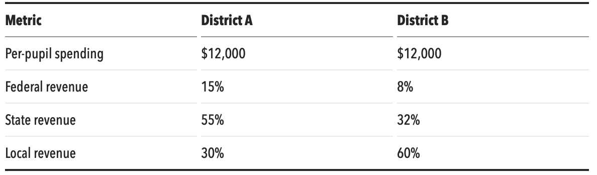
Both districts spend the same per student. But District B has nearly twice the local revenue share, meaning significantly more of their budget is under local control. When a principal in District B wants to purchase your software, they're more likely to find budget flexibility.
What High PPS Might Actually Indicate
When you see a district with notably high per-pupil spending, investigate further. High PPS often correlates with:
High special education populations
Special education services are expensive. Districts with high percentages of students with disabilities (SWD) will show elevated per-pupil spending, but that money is legally obligated for specialized services, not available for general purchasing.
Small district inefficiencies
Tiny districts (under 1,000 students) often show very high per-pupil spending due to lack of economies of scale. They still need a superintendent, central office, and infrastructure regardless of size. This doesn't mean they have big budgets—it means their fixed costs are distributed across fewer students.
Unusual geographic challenges
Island districts, remote Alaska villages, and districts spanning vast rural areas have logistics costs that inflate PPS without increasing instructional capacity.
Recent bond measures or facilities investments
Depending on how a state reports, capital expenditures or debt service might inflate apparent per-pupil spending in districts investing in new facilities. That money is committed to construction, not software purchases.
What Low PPS Might Actually Indicate
Conversely, lower per-pupil spending doesn't always mean a district lacks resources:
Efficient operations
Some well-run districts simply achieve more with less through effective management, shared services, and smart purchasing.
Lower regional costs
As discussed above, the same educational quality costs less to deliver in lower cost-of-living areas.
Conservative budgeting
Districts in communities that value fiscal restraint may maintain reserves rather than maximize current spending. They have capacity; they choose not to use it all.
Growth districts
Rapidly growing districts sometimes show lower PPS because enrollment is increasing faster than revenue. These districts often have bond funding for facilities and may be catching up on per-pupil services—potentially creating buying opportunities.
A Better Framework: PPS + Context
Rather than using per-pupil spending as a standalone qualifier, combine it with other data points:
Compare within state, not across states
How does this district's PPS compare to other districts in the same state? A district at the 75th percentile within its state has genuinely elevated spending relative to its peers.
Look at local revenue percentage
Higher local revenue share often means more discretionary flexibility, regardless of total PPS.
Consider the district type
Compare suburban to suburban, rural to rural. A rural district's high PPS due to transportation costs isn't comparable to a suburban district's high PPS from wealthy property tax base.
Check enrollment trends
Growing districts may have lower PPS but increasing budgets. Declining districts may have higher PPS but shrinking absolute dollars.
Factor in your product category
If you're selling curriculum, look at instructional spending specifically (often broken out in detailed finance data). If you're selling administrative software, per-pupil spending on administration is more relevant than the total figure.
Practical Application: Reading a District Profile
Let's walk through how to interpret PPS in context.
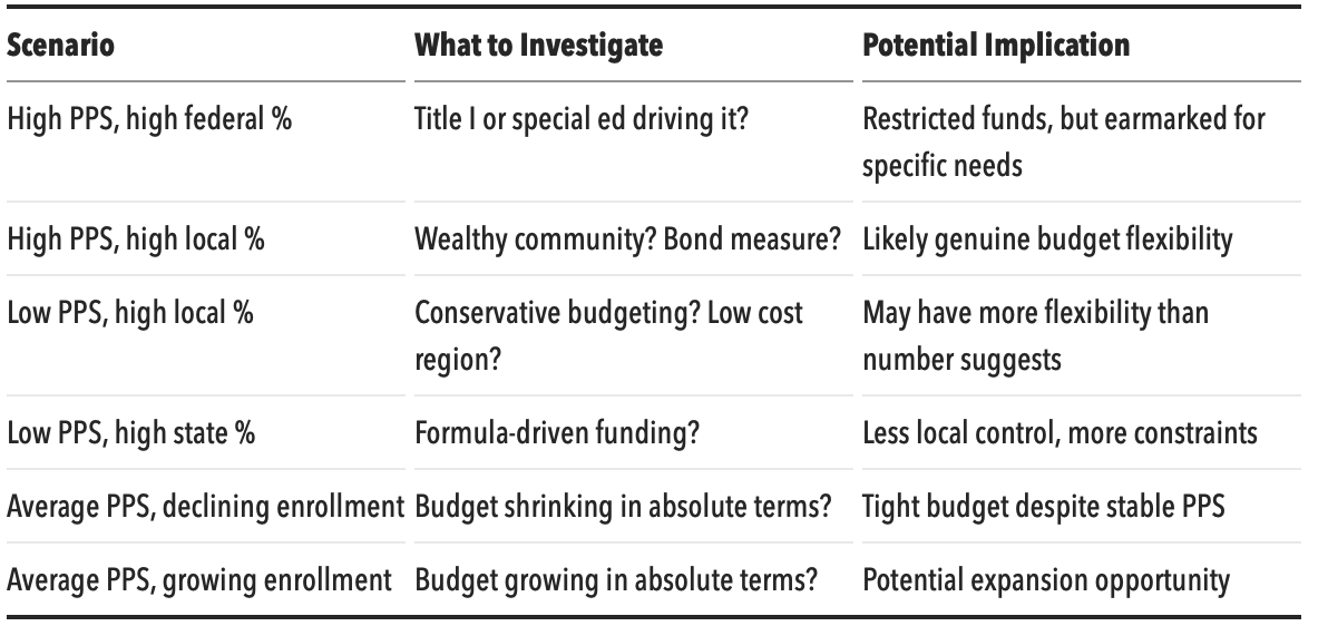
Scenario 1: High PPS, High Federal Revenue
You see a district with $16,000 PPS (well above state average) but 18% federal revenue.
Interpretation: This district receives significant federal funding, likely due to high poverty (Title I) or high special education needs (IDEA). The high PPS doesn't necessarily mean discretionary wealth. Investigate what's driving the federal allocation. If it's Title I, that's potentially good for your instructional product. If it's primarily IDEA, the money is committed to special education services.
Scenario 2: Low PPS, High Local Revenue
You see a district with $9,500 PPS (below state average) but 65% local revenue.
Interpretation: This district is relatively self-funded with strong local control. The "low" PPS might reflect conservative budgeting or low regional costs rather than poverty. Don't automatically deprioritize—this district may have budget flexibility despite the lower headline number.
Scenario 3: Average PPS, Declining Enrollment
You see a district with $12,000 PPS (at state average) but enrollment down 8% over 5 years.
Interpretation: This district is likely experiencing budget pressure. Declining enrollment means declining state funding in most funding formulas. The stable PPS might mask the fact that total budget has decreased. Expect tight budgets and potentially longer sales cycles as they scrutinize every purchase.
Questions to Ask That Go Beyond PPS
When you're on a call with a district, don't just accept PPS at face value. Dig deeper:
- "How would you describe your budget situation heading into next year—growing, stable, or tightening?"
- "What percentage of your budget comes from local property taxes versus state formula funding?"
- "Have there been any recent changes to your funding—new bond measures, expiring grants, or state formula changes?"
- "Where in your budget do technology purchases typically come from?"
These questions get you real-time budget intelligence that no static data point can provide.
The Bottom Line
Per-pupil spending is a starting point, not a conclusion. It tells you something about a district, but what it tells you depends entirely on context.
Smart use of PPS:
- Compare within state, not across states
- Consider alongside local revenue percentage
- Adjust for district type and demographics
- Use as one factor among many, not a standalone qualifier
Naive use of PPS:
- Ranking all prospects by PPS regardless of geography
- Assuming high PPS = big budget for your product
- Deprioritizing "low" PPS districts without investigation
The best sales reps use per-pupil spending as a conversation starter, not a conversation ender. They know the number opens questions rather than closing them.
---
Quick Reference: Per-Pupil Spending Interpretation